Coke Billboard
Google Design
 |
| Tennis player with tennis ball and text next to him. |
 |
| What the brush turned out like. |
 |
| The end result |
 |
| The font on my Coke bottle. |
 |
| My billboard picture. Before and After. |
 |
The sun rise after I used the filter
and the "thank you for sharing" slogan with glow added. |
 |
| The end result |
 |
This is my Coke sign on a billboard.
All I have to do now is add some filters and add my name onto the Coke
bottle
|

 |
The Brush
set I used From:
http://fbrushes.com/ water-photoshop-brushes/ |
 |
| The picture I got the silhouettes form |
 |
| My Google design so far |
 |
The picture I am
now using for my
space shuttle
|
 |
| The planet Brush set i used for my background. From http://fbrushes.com/planet-brushes-2/ |
 |
| The new Coke bottle for my name. |
 |
| What my Final Copy looks like so far |


 |
|
Nike
Logo
This
inspired me because the effects coming off of it would be a great effect to put
incorporate into my "share a Coke with the Universe" picure because catches your eye ans it would look cool.
|
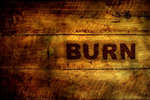 |
Burn
Effect
I
thought that this would be useful because it could, if used in the right way,
be able show burn marks from rockets in the "share a Coke with the Universe"
billboard design.
|
 |
|
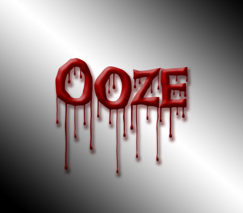
Ooze
Effect
I
thought that this would be a great edition to one of my Google logo because I
could change it from red to a blue kind of see through colour so that it looks
like "Google is sweating" then at the end of the sweat beads I would
have them turn into athletes doing sports at the Olympics.
http://photoshop-dragon.com/Tutorials/Text_Effects/Images/Bloody_Text/final.jpg |
 |
Basketball
Player with liquid effect
Same
kind of concept as the Ooze picture.
http://creativefan.com/files/2010/10/tutorial-2-500x369.jpg |


 |
| I made it look like the Pope is actually holding the Coke bottle up to show the crowd
·
Design
Ideas: Have the Pope holding a Coke and have it say "share a Coke with
Pope"
·
Colour
Ideas: Make the colour of the font that I will put in the same colour as the
Coca-Cola red so it effective and makes you want to have Coke because the
colour red makes you feel hungry.
·
Fonts: I
would get the Coke Font so that it looks just like the real fonts
·
Photoshop
Techniques: I would use the Palette Knife so it gives it a cartoon like effect
so that it looks better. The Magic Wand Tool and the Magic Select Tool to
select the background of the Coke bottle so i can make it look like he is
holding it.
|
 |
| The "C" is incorperated into the wave |
 |
Each bottle represents one of the rockets on a space shuttle
|
